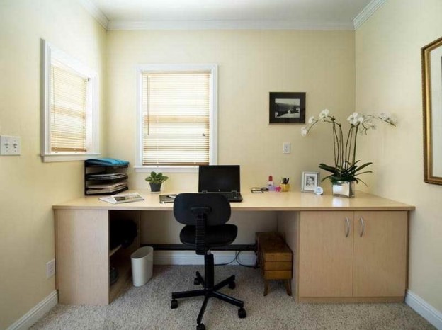
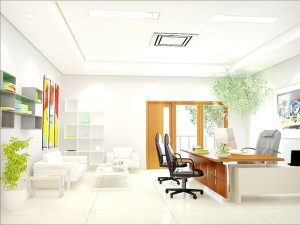
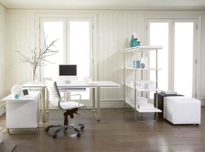
Decorating a small office does not have to be a problem if we follow a series of practical tips. One of the most important aspects when making the most of small spaces is to choose the right colors to paint the walls and ceilings. The color for an office has a very positive effect on our mood but it can also help to create optical effects that make space seem more spacious and bright. The overall goal is to bring light to that space. This is much simpler if the room we have to decorate has a lot of natural light but if you do not have it, do not despair and follow the following tricks to paint small offices.
- Light colors
First, we will choose light tones that create an effect of spaciousness and comfort. These colors reflect the light making the rooms feel more spacious. Within the light tones, we can choose the white and all its range of shades. At first sight, white can make us a boring color but in reality, it has many different shades. The best way to get the most out of it is by using these white shades to combine them with other colors. A very good idea is to combine the white with touches of color in the decoration as for example giving a note of joy choosing a chair or other small element of a cheerful color. Another color very suitable for painting small offices is fresh blue. Warm colors create closeness effects so we are not interested, while cold tones, on the other hand, seem to be farther away, making the spaces look much wider and wider. In this way, the walls seem to separate and the rooms grow. Finally, we have neutral colors such as beige, gray or brown that helps the eyesight not stop at any element creating a lot of harmonies. For the rest it is important that there is no type of wallpaper since the patterns, in general, makes space is perceived as more full and reduced.
- Color continuity
The chromatic continuity is a very important option since it allows to create harmonic spaces. In general, we will choose the same color for walls and ceiling creating continuity in the color that picks up the light. If we eliminate the pictures and maintain the order we will be able to enhance this effect much more. If we also choose curtains and paint the windows of the same color we will make the ceiling look much higher.
What we propose is just not to do what you see in the following image. The first mistake is to have chosen dark furniture that absorbs light instead of bouncing it. In this way, the room looks much smaller and more oppressive. Is it true that you do not feel like working in this space?
Another mistake is having painted the wall black. It is the worst color that could have been chosen. It is the darkest color that exists and extinguishes the rooms. It is not that it is a forbidden color but of course it is a bad choice if we talk about small spaces. In addition to being next to such white walls breaks with the continuity and harmony of space.
- Much lighter roofs
Regardless of the color that is chosen, the ideal to enlarge the space is to paint the ceiling lighter than the walls. One of the best options for painting the ceiling is white because it makes the walls look taller and creates the illusion that the ceiling is much higher.
- Exceptions to all of the above
In this section, we are going to give a series of ideas that contradict what we have exposed so far that basically, it is necessary to paint small offices
-Choose clear colors; if possible white or cold tones
-Pin all walls of the same color to generate color continuity
-Paint ceilings lighter colors than walls
To create a depth effect you can paint the wall opposite the entrance a darker pair of shades. In this way, it will seem that the walls are separated and there is more space. This effect will be much more enhanced if there is a window on that wall.
There is a belief that the prints create an optical illusion that makes space be perceived as more full and oppressive. This is so in general but there are exceptions, such as stripes that help increase the perception of space. If we paint wide strips of color we will generate an effect of greater depth while with narrow stripes it will seem that the room has more height. Another very curious trick is to paint the walls making a gradient. In this way, an optical effect is generated that makes us perceive the stay much wider.
keys to get Minimalist Offices
We had said that the ceilings should be painted lighter colors than the walls but there is an exception and that is when it is a small room with a very high ceiling. In this case, there is the possibility of painting the roof of a dark color to create a cozy refuge effect. In this way, we harmonize the small size of the room.


