Category Archives: Office Decoration

HOW TO FURNISH A SMALL OFFICE

HOW TO FURNISH A SMALL OFFICE

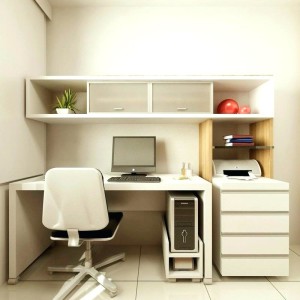
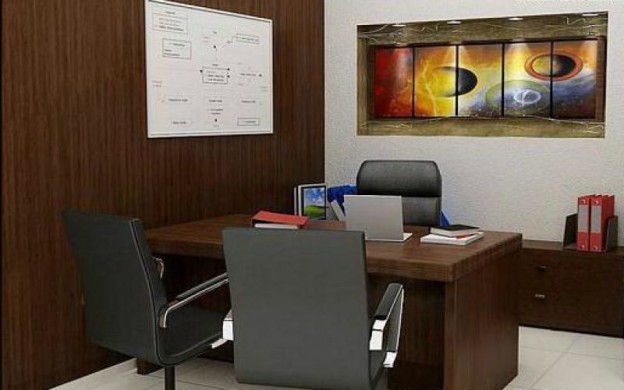
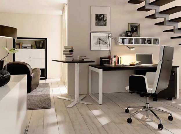
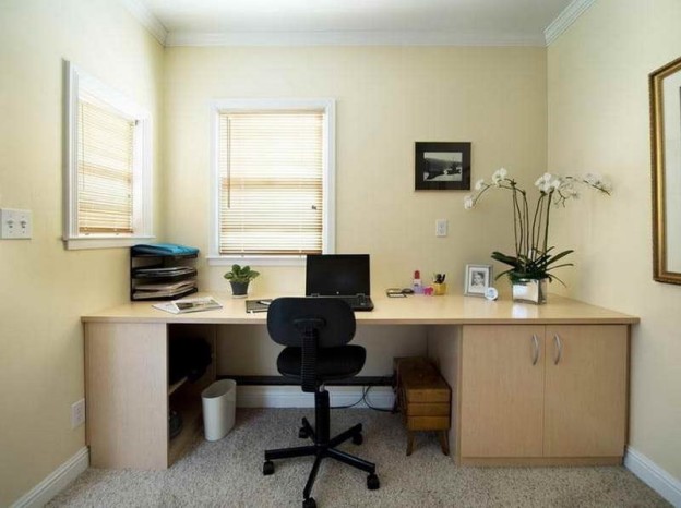
One of the fundamental premises for furnishing an office is to make the most of the space, giving priority to look for the perfect furniture, more for its usefulness than for its decorative function. If it is a question of furnishing a small office, we must give even more importance to this aspect.

When it comes to furnishing a small office, we can pay attention to the colors we use for the selection of furniture, as well as the design and comfort of the workers.

How to furnish a small office making the most of space

SPECIFIC FURNITURE FOR OFFICES

It is important to choose specific furniture for the workplace. Office furniture can vary in design, but all have in common that they seek worker comfort to develop their activity and fulfill a specific function in the workplace.

HOW TO FURNISH A SMALL OFFICE

It is important to use furniture designed expressly for office, since often we speak of ergonomic furniture, adaptable to the individual needs of each worker.

SPACE DISTRIBUTION

We must evaluate how much space we have available to place the necessary furniture. Before buying them you have to decide what the needs that exist in the office are and what furniture can satisfy them in the best way possible.

Furnishing a small office can be a challenge if we want to do without any furniture, but there is furniture with designs specially created for the office and that can meet our expectations occupying only the minimum space.

DECIDE THE TYPE OF FURNITURE

Once we know what the needs of the workers in the office are, we must choose the furniture. At this point we will have to take into account furniture intended for the continuous use of employees, such as office chairs and office tables, but also other necessary furniture, such as those intended for storage.

HOW TO FURNISH A SMALL OFFICE2

DECORATIVE ELEMENTS AND THE IMPORTANCE OF COLORS

Whether we talk about the color of the paint on the walls of the office or the furniture, we must take into account several aspects. If we need to furnish a small office, we will have to use light colors to give more spaciousness. The white color for the walls is a resource used in interior decoration to create the illusion of a more spacious place.

We can use other decorative elements, which will not be strictly furniture, to give a final touch to the office. The plants create a fresh and modern environment, in addition to providing color and life.

THE LIGHTING OF A SMALL OFFICE.

The selection of colors for the selection of furniture or the painting of the walls is as important as the lighting for furnishing a small office.

The ideal is natural lighting, if we can count on it. To make the most of the outside light we must use translucent white curtains, we can also use Japanese blinds or panels, which bring elegance and modernity to the decoration.

Although we have natural light, in the office there will be an electrical installation and we must think what is the most appropriate type of artificial light for a work environment.

Fluorescents are the kind of light that we usually find in many offices, but if we can choose, LED lights with a rather cold color temperature can be the most indicated.

WHAT ARE THE IDEAL COLORS FOR THE OFFICE

WHAT ARE THE IDEAL COLORS FOR THE OFFICE?

The colors of our workplace are important to generate a good environment and create a sense of comfort, in addition to promoting productivity. Today we talk about the colors for the office, which ones to choose and why they are the most recommended.

Our senses are stimulated by the aesthetics of the space where we are. Choosing furniture for an office is a very important task, but choosing the colors of the walls of our workplace is also something that we cannot leave to chance.

The colors for the office and how they generate a beneficial environment

The mood directly affects productivity at work. The more animated and happy we are, the more productive we are in carrying out activities. That is why choosing the right colors for the office will produce stimuli that can change our moods.

WHAT ARE THE IDEAL COLORS FOR THE OFFICE1

What to keep in mind to choose colors for the office?

We must take into account how big is the space we are going to paint. If it is a small or large office. In the case of being a small place we will have to choose colors that give the feeling of spaciousness.

The type of activity that takes place in our workspace is important to choose colors for the office. We will not paint the walls of the same color if it is an insurance company or a videogame developer.

We can also pay attention to the type of work that will be done in the office, if team work is common or employees develop activities individually.

What colors for the office are the most recommended?

THE TARGET

This is the color par excellence for any work space or home. It never goes out of style and brings luminosity. White is the sure bet when in doubt, and it is one of the colors for the perfect office if it is a small space.

THE GREY

This color is trend, brings elegance and modernity. It is perfect for an office with new technologies or for meeting places.

blue office

THE BLUE

Throughout its range, blue helps create relaxed environments and provides agility and stability. It is perfect for painting entire walls and combining it with white. It is the ideal color for waiting rooms or for places where work can generate stress. It is one of the most used office colors.


THE GREEN

This is a color highly recommended for offices because it provides stability and harmony. Remember nature, so you can generate relaxed environments in offices located in the heart of the city.

Green is also a very elegant color, ideal for offices where creative works are developed, such as advertising agencies.

THE YELLOW

THE YELLOW

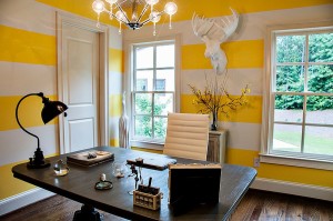
It is a warm color that is also a trend, especially mustard. It is perfect for places with large windows, where light is reflected on the walls. It generates a warm and welcoming atmosphere and is perfect for places where you work as a team.


THE RED

It may not be the perfect color to paint all the walls, but dark red is ideal for corners of the office. It provides objectivity and facilitates decisions.

At last choose the color wisely that also go with your office interior and the furniture.

HOW TO PAINT A PIECE OF FURNITURE OF ANOTHER COLOR

HOW TO PAINT A PIECE OF FURNITURE OF ANOTHER COLOR

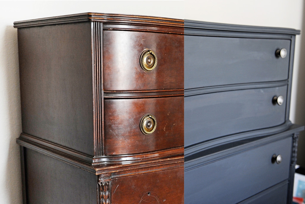
One of the best ways to renovate the decoration is to change the color of the furniture we already have. With a simple change of color we can give a complete turn to the environment of an office. Today we tell you the steps to carry out if we want to paint a piece of furniture of another color.

To change the color of a piece of furniture we must first take into account that it is possible to first remove the paint that is already on it . Wood furniture, whether made of solid wood or agglomerate, requires the following procedures.

Steps to paint a piece of furniture of another color

REMOVE THE FURNITURE

This will be the first thing we have to do if it is a piece of furniture in several pieces, such as a dresser or a file cabinet with drawers. We must separate each of these pieces to work with them individually.

HOW TO PAINT A PIECE OF FURNITURE OF ANOTHER COLOR

LINKED FROM PAINT

Sanding is an essential step to paint furniture of another color. We must carefully sand all the pieces and pay attention to the corners and corners. This step is especially necessary if the furniture has a varnish, which is the most usual regarding the finish of the paint.

We can use an electric sander for large and smooth areas and finish with hand sandpaper for corners where it does not enter.

After sanding the piece completely we must make sure to clean all the impurities of the varnish and the wood.

HOW TO PAINT A PIECE OF FURNITURE OF ANOTHER COLOR

BASE PAINT OR PRIMER

Before applying the final paint to the furniture, we must apply a base paint over the entire surface. This priming paint will help the final paint better cover the surface of the furniture. We apply it with a brush or roller, depending on the areas.

Some furniture paints, currently, come with the built-in primer, if so; we just have to make sure it is a quality painting that will give us an optimal result. We must completely cover the surface of the furniture, for all corners where we will then paint with the final color.

FINAL PAINTING

This is the penultimate step to paint a piece of furniture another color. In this case we must apply with a brush or roller two layers of paint, in this way, the furniture will be perfectly covered by the color we have chosen.

We advise you to take it easy, so that there are no bubbles in the paint, for this it is better to use the roller in all areas of the furniture that allow it.

POLYURETHANE OR VARNISH

The last layer that we will give the furniture will be varnish or polyurethane, to protect the paint. In case of using polyurethane, we recommend that it be water-based, just like painting. The polyurethane has different finishes, from matte, gloss or semi-gloss. Choose the one you like the most based on the feeling you want to get and the rest of the furniture found in the office.

In this case, apply two layers, and wait several hours between others. Once you have applied the last layer, we recommend that you wait a couple of days or three to use the furniture.

We hope you have been clear how to paint a piece of furniture of another color and, you know; if you have any questions or something to contribute, do not hesitate to leave us a comment.

TIPS FOR ORGANIZING A SMALL OFFICE

TIPS FOR ORGANIZING A SMALL OFFICE

Organizing a small office is essential to make the most of your space, maintain balance and order and create a good work environment that promotes productivity. We must prioritize the organization of the material with which we work, especially when it comes to documents. Keep in mind that we will need specific storage furniture and this will also occupy part of the space we have.

Today we tell you how to organize a small office

5 tips to organize a small office

GIVE PRIORITY TO MULTIFUNCTIONAL FURNITURE

In the case of organizing the space inside a small office we must bear in mind that the more furniture we use, the less free space we will be leaving. A room intended for work needs to breathe, and we must be smart when selecting office furniture to organize a small office.

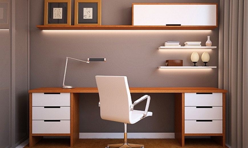
We are going to need tables and office chairs and also furniture for storage. To make the most of the space we can resort to shelves attached to the walls, especially placed in the highest part. Reduce the decorative elements to the minimalist to recharge the stay is important, but it is not necessary to eliminate them completely.

TIPS FOR ORGANIZING A SMALL OFFICE

DIVIDE THE SPACE WITHOUT LOSING AMPLITUDE

On many occasions, in the office we will need to create different environments to develop diverse activities, either with clients or for general meetings. For this the best thing is to use dividing panels that occupy the minimum space and that we can remove them at any time. Japanese panels can be perfect for this function, they bring elegance and functionality.

We can also use screens, curtains, sliding doors or any other element that we can easily remove to recover the space again.

COAT RACKS AND ORGANIZERS OF CLOTHES AND ACCESSORIES

When it comes to organizing a small office, we cannot forget the section on workers’ clothing. It is important to have a place to store coats and bags or backpacks. Placing a zone with a coat rack and a shelf at the entrance of the office will help to make the workspace more orderly. In this way, office workers can leave their warm clothes and their bags or backpacks at the entrance without interfering in the back of the chair.

TIPS FOR ORGANIZING A SMALL OFFICE

ORDERED CABLES

In an office many electronic devices are used, starting with computers, printers, photocopiers, projectors and others, depending on the activity performed in the office. For this the best thing is to have the professionalism of an electrician who arranges the wiring in a way that does not hinder when moving from one side to another. Not having the cables in view, above the tables or from one side of the floor to the other will avoid the sensation of disorder.

THE ARRANGEMENT OF TABLES

If we have to place several tables for the workers in the office, it is best to arrange them at the same address. The straight lines bring order and tranquility to the decoration of a room.

We must ensure that all tables are oriented in the same direction to achieve a relaxed atmosphere.

Keep the tables collected and with a minimalist decoration is also essential to organize a small office and get a sense of spaciousness.

How to Decorate a Meeting Room

How to Decorate a Office Meeting Room

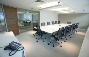
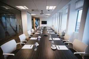
Properly decorating a meeting room is essential for the success of your business. He thinks that in this room important decisions are made for the company, new projects are proposed, different proposals are discussed and it is the place where both managers, clients, suppliers or the workers’ team pass. Therefore, the meeting room must convey an image of seriousness and professionalism and at the same time reflect the personality of the company.

Likewise, customers and employees, partners, managers or suppliers should feel comfortable in an environment that transmits well-being and tranquility and stand up to creativity, the generation of ideas and trust.

To achieve relaxed stays, there are certain aspects that play a decisive role, such as furniture, lighting, the choice of colors and materials and decorative elements. Here are some keys to getting your meeting room to guide you to the success of your business:

Furniture for meeting room

The furniture in the meeting room has to be comfortable and sober while appealing to make a good impression.

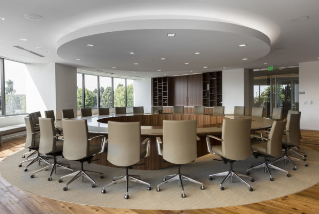
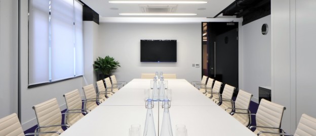
The table should be large to allow people to be distributed comfortably; It can be round or rectangular. We can choose a white table or clear tones, such as the Copenhagen design table. In addition, the white and matt tones of some elements of the furniture contribute to multiply the luminosity of this area.

The chairs have to be comfortable, ergonomic and preferably have wheels for their practicality and functionality – we will avoid scratching the floor. Betting on comfort and design for an element as important as the chairs for meeting rooms. And always make sure there are enough chairs for all your visits!

On the other hand, not always the meetings that take place in this room have to be strictly formal. In some organizations the meetings can be more relaxed and friendly and in this new environment, the low tables combined with poufs and sofas or even auxiliary furniture can be part of a place designed for meetings that promote productivity and well-being. A change in the conception of work spaces, which includes flexible furniture adapted to new forms of work in companies.

Lighting for meeting room

Another aspect to consider in the meeting room is lighting. And it is that light plays a very important role to create comfortable, warm and relaxed environments.

Natural light, according to experts, is not enough to work properly, so we must have spot lighting such as floor lamps and spotlights and ceiling lamps.

We can choose a floor lamp that does its decorative function, such as the spectacular Arco lamp, made with marble structure and rectangular steel tube, or the Twiggy lamp, inspired by the lamp of the same name and made of carbon steel. , aluminum and fiber tube.

If we do not have too much space and we do not want the floor lamp to have an excess of prominence in the meeting room, we can opt for something more discreet, such as the Jason lamp, inspired by the famous Jazz lamp, made of fiberglass and with intensity regulator.

The Ball Silver lamp   is an excellent choice to illuminate the meeting table concentrating attention on this part of the room, like the Cony lamp, inspired by the famous Stilnovo Spunik Lamp, a basic decorative accessory that adapts to any decorative style.

You can combine decorative originality with the combination of several lighting elements for your meeting room: floor lamps combined with wall lamps with clear industrial influence. A result that brings warmth and a certain intimacy to this room.

Meeting Room

Decorative objects for meeting room

In order to convey a sense of seriousness but warmth at the same time, we can use some decorative objects for our meeting room. Ideally, do not overload the room and bet on simple decorative elements, avoiding too personal details.

We can decorate the walls of the meeting room with designer clocks, paintings, company photographs, recognitions, or even decorate with plants to give a natural touch to this space. We can also reserve a corner for a coat rack, for the staff to leave their belongings.

color of Meeting Room

Color of the walls of the meeting room

If we want our meeting room to look broad and organized, white is undoubtedly the most suitable color for the walls. However, if we want to give a fun touch to this environment, we can paint one of the colored walls and break with the monotony of white. We can also opt for decorative vinyl, such as quotations, graphics, texts, notepads or maps of the world.

How to Decorate a Meeting Room

How to Decorate a Meeting Room?

Within the world of office design there are several key rooms that define your style and personality for third parties and three of them stand out especially: the reception, the waiting room and the meeting room, to which we dedicate today’s post.

The meeting room is an essential space in any office: either for internal meetings of the company team or external with customers, suppliers, shareholders or members of the board, the truth is that crucial decisions are made in every business and for this, it is vital to create a not only functional but also pleasant environment to encourage dialogue and avoid heated discussions.

On the other hand, the meeting room should be a clear reflection of the image that the company wants to project and therefore its design should be consistent with the rest of the office, not making it an island without any connection with the rest.

Therefore, when facing a design project for a meeting room we must attend to several aspects. We go with them!

Privacy

Probably the first point to raise when making the design project of the meeting room is the desired level of visual and acoustic privacy.

In this, as in everything, there are cases for all tastes: from companies that by the level of confidentiality of the issues to be addressed in meetings seek to isolate themselves completely to companies with an “open office ” philosophy in which there are no barriers, forming the Meeting room part of the rest of the work area. Let’s see the main options:

Closed rooms

When you want a total level of privacy both acoustic and visual, there is no doubt: the best thing is a closed room, with its conventional walls and doors.

And if we also want to avoid the echo, we can place perforated acoustic ceilings specially prepared for it.

The above does not mean, however, that inside the room we can opt for a creative interior, with the advantage that by having several walls we can use them to cover them with impacting materials or papers.

Open rooms

It is exactly the opposite case: the total opening both acoustic and visual , without walls or access doors, which allow complete freedom of movement and project an image of dynamism and absolute transparency, more typical of start-ups and young companies than of companies with great experience and solidity.

Glazed or semi-open rooms

When we look for visual amplitude and we do not care if they see us but do something more than listen to us, the ideal is to create glassed-in or semi-open meeting rooms, which mitigate the sound (although not as much as a wall) but let the interior be completely or partially.

If you want visual openness but minimal visual privacy, a very useful option is to install vinyl on the glass sheets (whether translucent or opaque, simple or with geometric designs), which also help prevent clueless clash against the glass thinking that there is nothing…

… Or, as in this other case, opt for semi-open rooms made of plastic materials that allow an interconnection with the rest of the office, guaranteeing, however, a minimum privacy.

Flexible Rooms

They are meeting rooms “de remo and pon”. They use space dividers such as curtains, Japanese panels and the like to allow visual and aesthetic amplitude when they are not being used and a certain visual privacy when a meeting is called.

Obviously in this case privacy is more visual than acoustic, since textiles, however heavy they are, only tinge the sound, but they always leave gaps where they sneak in, but they are an ideal, flexible and economical option for assembling meeting rooms in a pee pas.

Mixed or semi-private rooms

Finally, and given that not everything is black and white, there are mixed meeting rooms in which neither everything is a wall, nor everything is glass.

They are especially aesthetic rooms, which combine the acoustic privacy of solid materials such as wood or its derivatives with the visual opening of glass.

The materials

Choosing the base material of the room’s “continent” (walls, floors and ceilings) will condition both the content (furniture) and the general decoration.

Wood or assimilated

Both natural wood and its derivatives (laminates, laminated panels, etc.) are usually one of the most used materials, both for the good that they combine with the rest of the elements and for their contribution of warmth that they give to the whole.

However, at the time of applying it can be done in several ways: one, more traditional, mainly in floors, vertical panels or even some roof covering…

… Or in a more creative way, for example creating envelopes or combining them with ultramodern materials and bright colors to achieve an impact aesthetic.

Glass and Crystal

The glass, whether transparent, translucent or colored, is another prevailing material when designing a meeting room. It is typical of those outdoor meeting rooms where we find large windows or even glazed ceilings that give it a “high tech” aesthetic and that usually look for accompanying furniture (such as glass tables, glass lamps, etc.)

It can also be combined with other materials such as plastics or methacrylates to enhance the effect

Other materials

Concrete or exposed brick, fabrics for walls, wallpaper, freeze-dried moss, carpets and carpets or artificial turf floors are materials with which you can achieve very impressive results.

In these cases, when the material is placed in the focus, the furniture should be neutral to avoid visual confusion and give the first all the prominence.

The decoration

Once the main elements have been chosen, it is now necessary to design the general atmosphere of the meeting room. Here come into play issues such as the brand image, the “average age “of the company’s workers, the sector in which it moves, etc.

Sober Rooms

It is usually the most usual and conventional in the design projects of a meeting room. This is because companies often want to convey an image of seriousness, professionalism and good work, and this type of design is transmitted. In addition, the sober aesthetic makes it valid for all audiences, so that the same can be used for an internal meeting of work with customers of all types, character, age and nationality.

It is common in banking, insurance companies, and large solid companies or with history (construction companies, real estate companies, etc.).

They usually use neutral tones (white, black, gray or beige) although they can play with some elements such as lighting to give them a plus of creativity.

Color rooms

Unlike the previous ones, betting strongly on color has a risky but at the same time impressive component, since it is looking to surprise. Designing a colorful meeting room often creates a positive effect on your attendees, encourages more conversation and participation and gives a more informal point to meetings, although important issues are being addressed.

It is common in start-ups, dynamic companies based on the Internet world, advertising agencies or companies in which design and creativity are part of its leitmotif.

Typographic Rooms

The rooms that play with typography as a strong point usually prioritize the message and encourage conversation and the exchange of ideas . Perfect for internal brainstorming meetings, they have, like the previous ones, a young and informal point that relaxes the environment without having to resort to color in this case.

Very common also in marketing agencies, creative start-ups and of course, companies in which graphic design is part of its core business.

Table

And once decided the atmosphere and style of our room, it is necessary to go into detail and choose its main components: the table and the chairs.

Although it sounds like a truism, the table in the meeting room should have a larger or smaller size depending on the size of the company (a micropyme of 4 people is not the same as a large company with a large team). Therefore, assessing how many people on average attend the meetings will be key to determining if the table should be more or less large to accommodate a greater or lesser number of attendees.

Circular tables

In many cases, for SMEs or small offices, a table for 6 or 8 people will suffice, in which case a round table is recommended, which facilitates proximity and conversation by placing everyone on an equal footing.

Rectangular tables

On the contrary, when a large number of people attend the meetings, the ideal is the traditional rectangular oblong table, arranging the seats around it and leaving the presidency to the person organizing the meeting or to the highest position of the company.

The chairs

The choice of the chair is a very personal element that will undoubtedly mark the character of the room, given that its strong presence and repetition of elements will give much of the protagonism. In this decision usually come into play combinations of functional, aesthetic and budgetary aspects that will have to be assessed.

Rotating chairs

At a functional level, the ideal for a large work table such as the meeting room is to have chairs with wheels that allow easy mobility, preferably with arms for greater comfort. And if they are adjustable in height with some type of actuator that raises or lowers the axis vertically, it will already be the sumum of comfort 🙂

Semigiratory chairs

However, if you choose aesthetics or give a different air to the room, you can choose fixed chairs and swivel seat , which allow you to move to the right and left without moving the chair itself, very useful for example if there is any kind of projection at the meeting.

Fixed chairs

As a third option, the fixed chairs will always remain, either with a conventional or skateboard leg (those that normally form a kind of lateral U). They are less functional but in exchange we can find much more variety at the aesthetic and budgetary level to adjust to the decoration of the room.

In any case, with regard to the arms, we must be careful that they are low enough to enter under the table (whose height is usually 75cm), so that one can get close enough to her. In theory the work chairs come prepared for it, but it will not be the first time that we do not take this into account and we find that they hit the edge.

In short, a whole world of options to decorate a meeting room and transmit the image of the company that we have marked. We leave you with some more options as inspiration … and let the ideas flow!
OFFICE DECORATION

OFFICE DECORATION

Today we are going to talk about a trend in office decoration that has been attracting companies and professionals from all corners of the world for years: the Feng Shui style .

Feng Shui in the workplace

Air and Water , that would be the translation of a Chinese term that has more than 6,000 years of history, the Feng-Shui. It is not easy to define a science so old and far from our Western culture practice. Perhaps we could say that Feng Shui is a mixture of philosophy and art that studies how the energy of the environment and objects can affect our physical and mental balance.

According to practitioners of Feng Shui philosophy, both the work environment and the furniture, accessories and ornaments that are part of our work space contain energy and this energy affects not only our own well-being, but the material well-being of work in Yes, the level of productivity of employees and managers and the good or bad luck we have in business.

Useful office decoration tips Feng Shui.

If you are thinking of redecorating your office, the office of your house or your training center following the guidelines of this ancient oriental discipline, surely you are useful the following tips or basic tips on the Feng Shui decoration style :

The waiting room

Normally, the waiting room of an office is very close to the entrance door and, if the company occupies several floors, it is usually located on the ground floor. This space of entry to the workspace is fundamental for Feng Shui : do not recharge the space with large furniture, umbrella stands, shelves or huge green plants. The space should be as clear as possible , the furniture should be discreet and rounded, it should have some comfortable seats with neutral colors, small plants with rounded leaves (never pointed and sharp leaves) and, if possible, some flowers of vibrant colors that transmit energy and good vibrations .

The stairs

If your work center is distributed over several floors, the Feng Shui style recommends applying the following guidelines to balance the flow of positive energy : place discreet green plants both at the beginning of the ascent and in the landings if you have them; If you put pictures or photographs on the walls, you will achieve a less pronounced ascent and, in addition, you will symbolically unite those work environments that are physically separated; the color of the staircase should be darker than that of the walls, you can reinforce the lighting with discreet wall sconces or pictures of bright colors.

The common space

The trend of creation of diaphanous work spaces fits like a glove in the philosophy of Feng Shui decoration . For Feng Shui, the obstacle-free space is perfect to let flow that positive energy that affects the level of happiness and productivity of the people who live together and work together. Feng Shui advises that the work space should be as wide as possible and, if the available meters do not allow it , arrange the furniture and accessories in a way that obstructs as little as possible to the eye.

To divide the space of the common work area, Feng Shui recommends using screens , screens or decorative elements that guarantee the privacy and concentration of employees, but do not interrupt the passage of positive energy as do conventional partitions.

Do you think the Feng Shui style would adapt to your office or office? Share your impressions in our blog!

Office Paint Ideas and Tips

Colors for Painting Small Offices

Decorating a small office does not have to be a problem if we follow a series of practical tips. One of the most important aspects when making the most of small spaces is to choose the right colors to paint the walls and ceilings. The color for an office has a very positive effect on our mood but it can also help to create optical effects that make space seem more spacious and bright. The overall goal is to bring light to that space. This is much simpler if the room we have to decorate has a lot of natural light but if you do not have it, do not despair and follow the following tricks to paint small offices.

  1. Light colors

First, we will choose light tones that create an effect of spaciousness and comfort. These colors reflect the light making the rooms feel more spacious. Within the light tones, we can choose the white and all its range of shades. At first sight, white can make us a boring color but in reality, it has many different shades. The best way to get the most out of it is by using these white shades to combine them with other colors. A very good idea is to combine the white with touches of color in the decoration as for example giving a note of joy choosing a chair or other small element of a cheerful color. Another color very suitable for painting small offices is fresh blue. Warm colors create closeness effects so we are not interested, while cold tones, on the other hand, seem to be farther away, making the spaces look much wider and wider. In this way, the walls seem to separate and the rooms grow. Finally, we have neutral colors such as beige, gray or brown that helps the eyesight not stop at any element creating a lot of harmonies. For the rest it is important that there is no type of wallpaper since the patterns, in general, makes space is perceived as more full and reduced.

white office paint ideas

  1. Color continuity

The chromatic continuity is a very important option since it allows to create harmonic spaces. In general, we will choose the same color for walls and ceiling creating continuity in the color that picks up the light. If we eliminate the pictures and maintain the order we will be able to enhance this effect much more. If we also choose curtains and paint the windows of the same color we will make the ceiling look much higher.

What we propose is just not to do what you see in the following image. The first mistake is to have chosen dark furniture that absorbs light instead of bouncing it. In this way, the room looks much smaller and more oppressive. Is it true that you do not feel like working in this space?

Another mistake is having painted the wall black. It is the worst color that could have been chosen. It is the darkest color that exists and extinguishes the rooms. It is not that it is a forbidden color but of course it is a bad choice if we talk about small spaces. In addition to being next to such white walls breaks with the continuity and harmony of space.

Modern Office Paint

  1. Much lighter roofs

Regardless of the color that is chosen, the ideal to enlarge the space is to paint the ceiling lighter than the walls. One of the best options for painting the ceiling is white because it makes the walls look taller and creates the illusion that the ceiling is much higher.

  1. Exceptions to all of the above

In this section, we are going to give a series of ideas that contradict what we have exposed so far that basically, it is necessary to paint small offices

-Choose clear colors; if possible white or cold tones

-Pin all walls of the same color to generate color continuity

-Paint ceilings lighter colors than walls

To create a depth effect you can paint the wall opposite the entrance a darker pair of shades. In this way, it will seem that the walls are separated and there is more space. This effect will be much more enhanced if there is a window on that wall.

Office Interior Painting

There is a belief that the prints create an optical illusion that makes space be perceived as more full and oppressive. This is so in general but there are exceptions, such as stripes that help increase the perception of space. If we paint wide strips of color we will generate an effect of greater depth while with narrow stripes it will seem that the room has more height. Another very curious trick is to paint the walls making a gradient. In this way, an optical effect is generated that makes us perceive the stay much wider.

keys to get Minimalist Offices

We had said that the ceilings should be painted lighter colors than the walls but there is an exception and that is when it is a small room with a very high ceiling. In this case, there is the possibility of painting the roof of a dark color to create a cozy refuge effect. In this way, we harmonize the small size of the room.

Vintage Office Decoration

Vintage Office Decoration

What is the difference between retro and vintage?

The term retro refers to new objects that are reminiscent of the past (whether imitating techniques, materials, etc.). It is quite common, the incorrect use of the term “retro style” to speak of a style created in the past. The retro style is always a style created in the present, which uses new objects but wants to imitate or refer to a recent past (15-20 years ago). The most common is that this style focuses on relatively recent products, fashions, and artistic styles; produced from the Industrial Revolution. From a philosophical point of view, the word retro implies a point of irony and is related to the concept of “nostalgia not sentimental”. That is, retro describes the desire to capture something from the past and evokes nostalgia full of dissatisfaction with the present that causes a certain cynicism.

It is increasingly common to combine several styles or decades in the same environment. Sometimes it is enough to place a retro object, be it a chair, a lamp or a simple pencil sharpener, to break with the dynamics of the space and give a modern touch. Although it is incorrect to refer to them as vintage objects if we can talk about vintage reproductions or objects inspired by vintage. They are the alternative for those who admire a style of the past and cannot afford it or prefer to acquire a contemporary interpretation.

Vintage, on the other hand, is the word for all objects and garments designed and manufactured in the past.

Vintage is a concept that etymologically derives from the harvest of wine and means that the object itself has improved or revalued over time, although it cannot yet be classified as antiquity.

Office Decoration with Plant

Sometimes vintage objects are well preserved because they were part of a stock that was not sold and therefore are completely new. As it is not always the case, in the decoration of vintage offices it is common to restore these objects and accept some wear as part of the aesthetics.

Chairs for a vintage office decoration

Although, as we have seen previously, vintage is a concept that refers to products manufactured in the recent past; many people associate this word with the decade of the seventies. The chairs of this era were not only more stylish than those of previous decades but they were also much more functional. The seats of the 70’s were softer and had higher backs so the comfort of the user was much higher. It was common to put armrests and use a skin.

What worship chairs have these decades left us? It is difficult to make a selection of so many possibilities but from the sixties we were left with the chair Panton (1960) Verner Panton was the first chair made of synthetic material in a single mold and the chair Ball (1966), also called Bubble Chair, designed by Eero Aarnio who designed it more as a piece of architecture than a piece of furniture. The chair creates spaces of total privacy within a shared space.

Of the decade of the seventies, we would emphasize very especially the chair Support (1979) of Fred Scott that was voted in the International Federation of Architects of 1991 as “the chair that has most influenced the office furniture“. It was one of the first office chairs designed following strict ergonomic principles. Frederick Scott designed a whole collection of chairs that could be adapted to different tasks typical of the world of the office: from desk tasks to board tables, waiting rooms or shared places.

But vintage chairs do not end there. The decades of the 80s and 90s also offer many aesthetic options and curiosities for the decoration of vintage offices. Do we see some?

We find that the chairs of this decade must adapt to the beginning of the digital age. It was at that moment when the offices finally began to look like the current offices. It was essential to design comfortable chairs as employees spent more and more time in front of computers. The eighties are the beginnings of ergonomics applied massively to office furniture. This translates into cushioned chairs, armrests and even the possibility of adjusting the chair to the user’s characteristics.

The desire and need to make the chairs as ergonomic as possible continues during the nineties. The seats are becoming sophisticated and becoming as technological as the elements used in the office itself. A great example of this is the iconic Aeron chair (1992) designed by Donald Chadwick and William Stumpf.

Office Decoration with Plants

Office Decoration with Plants

Plants are one of those elements that can turn any space into a cozy place. In terms of decoration, we usually associate them with the home, but its strategic use in the workspace is increasingly fashionable.

We often do not have the authority to decide how to decorate our office, this changes and it is one of the advantages of working at home since you can design your space in your own way. But the decoration of offices with plants helps the worker to feel more connected with nature and therefore helps concentration, to develop creativity and promotes calm. The companies are aware of its benefits and recent work on its implementation.

As we saw a while ago, one of the trends in offices, which also increases productivity, is the nature of the workspace. In this article we will explore some ideas about office decoration with plants and we will also see which plants are best suited to decorate the offices and why.

Nothing better than some pots to brighten up our desk and workspace. But the decoration of offices with plants is much more. Do you dare to explore it with us?

VERTICAL GARDEN

A strategy widely used in the decoration of offices with plants is that of the vertical garden. To take this concept so associated with the exteriors to a more formal point, the idea is to create flat surfaces where to apply the plants. That is something like paintings made with plants. Do you dare to see some examples?

This strategy is perfect to give an organic air to the reception (as is the case of the Google offices in Sydney) or to give life to corridors and common areas. It can even be the star element of an office or meeting room.

Office Colour Ideas and Tips

INTEGRATED VEGETATION

Nothing else in to enter plants in the architectural planning office. Do not think of plants as mere decorative objects, think of them as just another structural element. You will get a natural and relaxed air to the office, keeping it professional and stylish.

A very interesting resource to integrate plants in office decoration is to incorporate pots on the tables. This means not treating the pots as pots or centerpieces but as a structural part of the furniture.

GARDENS WITHIN THE OFFICE

At this point, why not bring the concept of the garden to the office? Take advantage of forgotten corners and common areas to create a natural and relaxed atmosphere. Join several plants on a surface of stones or use artificial turf and some natural plants to create the favorite space of all, green offices of great beauty.

KOKEDAMA

The latest in air plants is called kokedama. This Japanese technique literally means “moss ball” and is a type of crop that is characterized by not using any type of pot but moss. It usually consists of a sphere that usually grows hanging. The applications of this innovative technique are multiple. Hang plants everywhere and glad corridors and offices. Nothing better to give a modern and flirtatious look to your office!

THE BEST PLANTS FOR THE OFFICE

Finally, we have selected the five most suitable plants to grow in the office. All of them have in common that they need little care and that the interiors are their favorite medium. Do you want to find out what they are?

Modular Office Furniture India

  1. Dracaena

A very robust plant that has proven to be one of the plants that best adapts to indoor growth. One of the most positive points of this plant is that it does not need to be watered too much; it survives with little water since its roots accumulate moisture.

  1. Epipremnum aureum

Better known as “poto”, it is one of the best office decoration options with plants. Not only because it is a type of plant that is very easy to care for but also because it is effective against indoor environmental contamination, eliminating formaldehyde, xylene, and benzene; also reducing the ozone produced by printers and photocopiers. It needs indirect light and watered when the earth is dry.

  1. Cactus

The cactus and succulents are the perfect plants for those who do not have too much time to take care of them. Besides being the latest fashion will give a lot of personality to your desktop. Go ahead to create centerpieces and compositions with them.

  1. Sanseviera

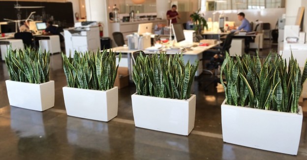
The Sanseviera, also known as Sword of St. George or Mother-in-Law, has a reputation as indestructible. It is one of the most resistant indoor plants because it supports the dry and hot atmosphere of the rooms and the lack of light. It also supports that you do not water it too much or that it is transplanted. That is, it is perfect for decorating the office.

  1. Adam’s Rib

The rib of Adam is a very easy to care plant. Indoors you need a bright place. It is not a demanding plant in terms of risks. In addition, despite the size of its leaves it does not demand to be pulverized since it tolerates dry environments.